CHOCOLATE BAR REDESIGN
-
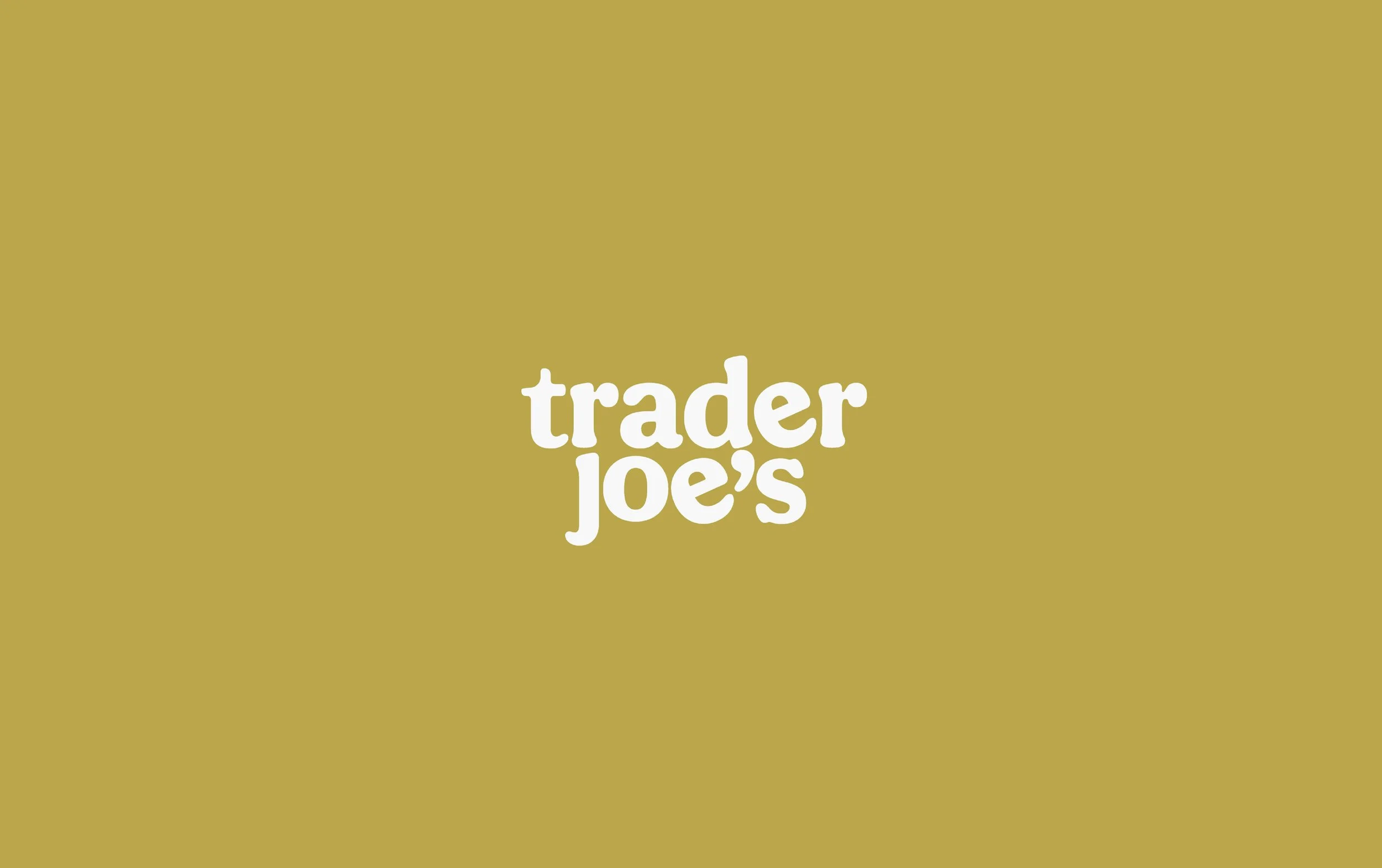
I was tasked with designing the packaging and an updated logo for a chocolate bar from Trader Joe’s.
-
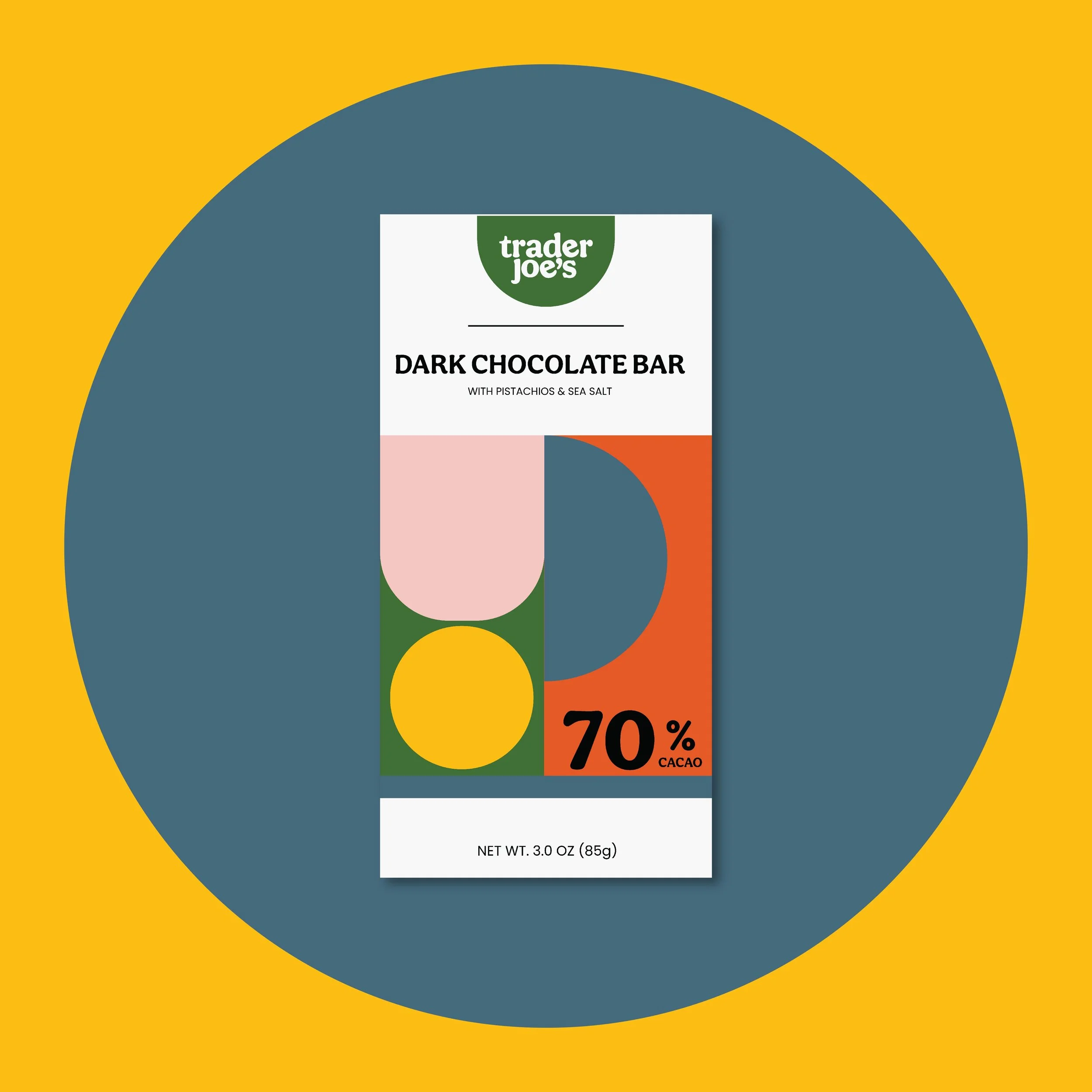
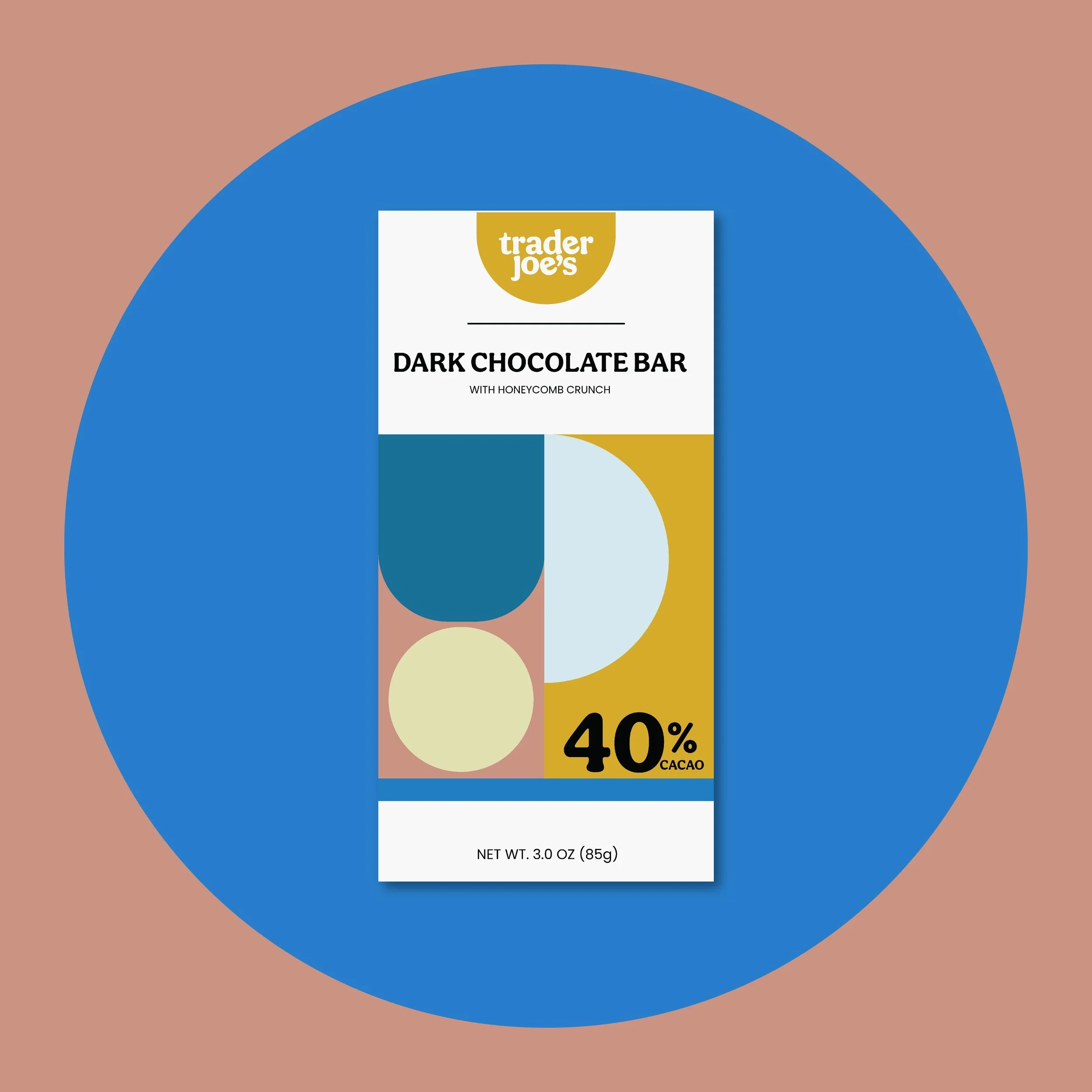
The goal with this design was to create something minimalistic yet vibrant and eye-catching to capture the attention of customers. Especially in a store like Trader Joe’s, it’s important that the packaging is bold enough to stand out amongst so many other bright designs.
-
Food
-
Packaging


KEY WORDS
Bright
Eye Catching
Simple
Recognizable

DESIGN NOTES
This design is both simple yet fun. By maintaining a cohesive design but switching the colors based on the flavor, this packaging makes for a great gift or treat!